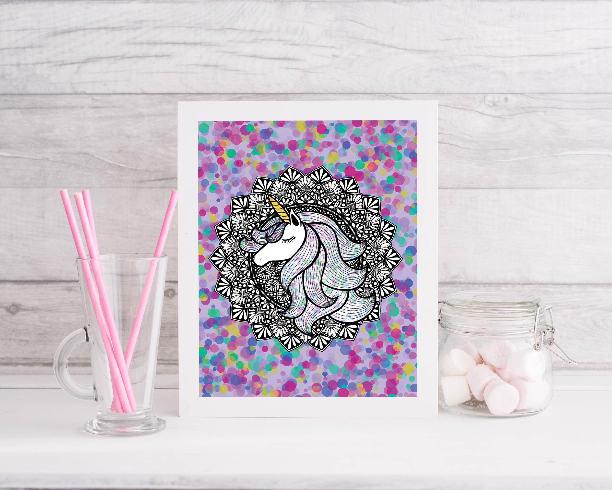
Your print has arrived. It is rolled carefully in a tube, or flat in a protective sleeve, and it looks beautiful against the plain white of its packaging. The next question — where does it go, and how does it get there? — turns out to involve more decisions than most people expect. Frame material, mat width, glass type, wall height, hardware load capacity: each one affects the final result.
This guide is the one we wish we had been given when we first started hanging our own work. It is written for people who have never framed a print before, and for those who have done it but suspect they have been doing it slightly wrong. We will move through the process in order, from frame selection to the final nail in the wall.
Step 1: Choosing the Right Frame
The frame's job is to present the artwork, not compete with it. A well-chosen frame recedes slightly — it defines the boundary of the work and tells the eye where to look, without drawing attention to itself. A poorly chosen frame argues with the print for dominance, and the print always loses.
Frame Material
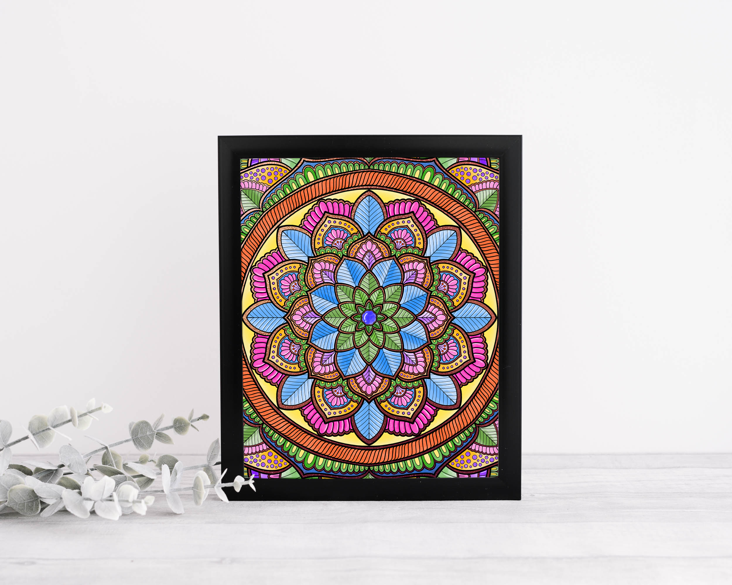
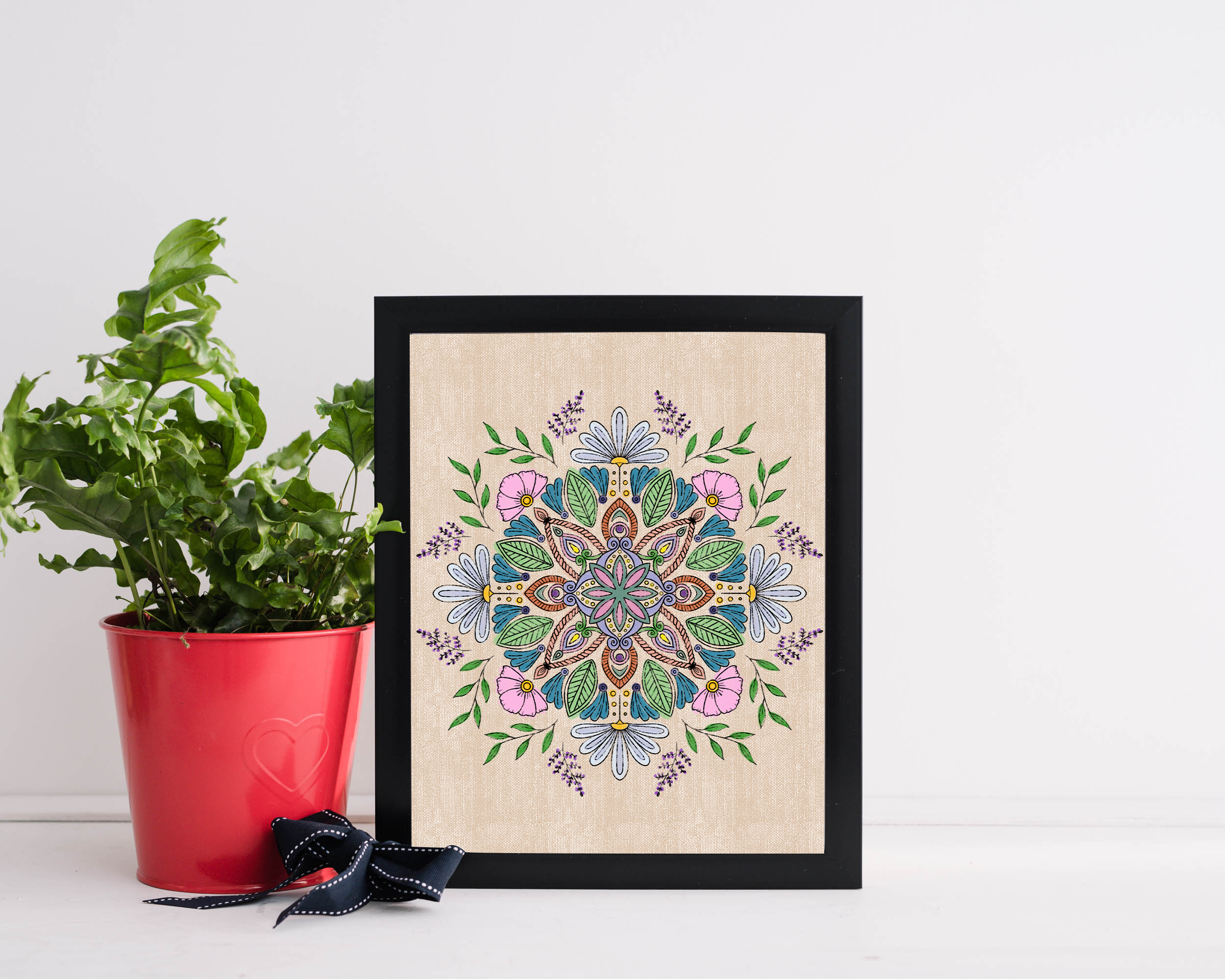
Wood frames are the most versatile and the most forgiving. Natural wood, painted white, painted black, and stained finishes all have different personalities and suit different work. For our mandala prints — with their organic, hand-drawn quality — we consistently recommend natural or lightly finished wood over metal. Metal frames read as more industrial and contemporary; they work beautifully for certain aesthetics but can flatten the warmth of organic, patterned work.
Avoid plastic or resin frames for archival prints. They off-gas compounds that can, over time, affect the print's chemistry — particularly in enclosed frames without UV-protective glazing.
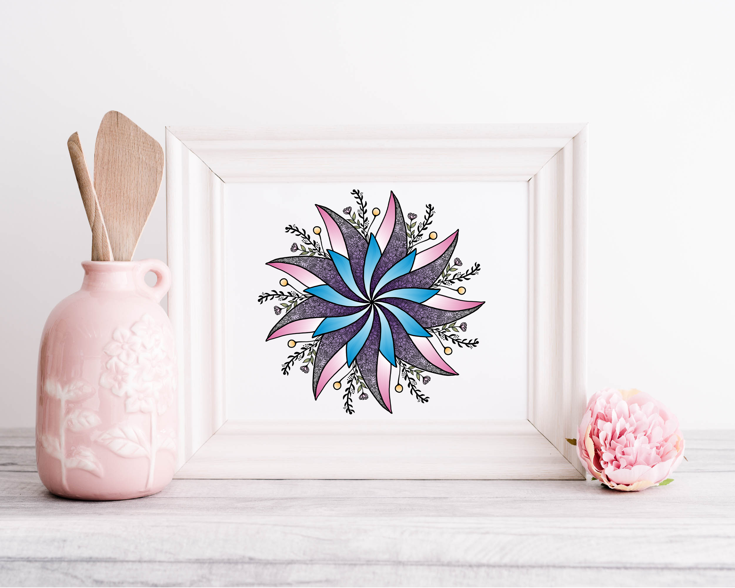
White-painted wood is one of the most universally flattering frame choices for mandala and botanical prints.
Frame Colour
Three options work well for almost any art print: natural wood, white, and black. Each creates a different relationship with the work.
Natural wood adds warmth and feels artisanal — it complements organic, hand-drawn work particularly well and integrates easily into rooms with warm-toned furniture and textiles. White is the gallery standard for good reason: it is neutral, it emphasises the colours within the print, and it suits almost any wall colour. It is the safest choice when in doubt. Black creates contrast and drama — it works especially well for high-detail black-and-white linework, where it mirrors the ink and creates a cohesive composition.
Frame Depth and Profile
Thin profiles (8–15mm wide) look contemporary and minimal — they work well for medium and smaller prints where the artwork has enough visual weight to carry itself. Wider profiles (20–40mm) feel more traditional and substantial — they add a sense of occasion to larger pieces and create a stronger visual anchor on a wall. For most of our A3 and A2 prints, a profile width of 15–25mm is the sweet spot.
Step 2: To Mat or Not to Mat
A mat (also called a mount or passepartout) is the border of card that sits between the frame and the print, creating a visual breathing space. It is not merely decorative — it also serves a protective function, preventing the print's surface from touching the glazing, which matters enormously for longevity.
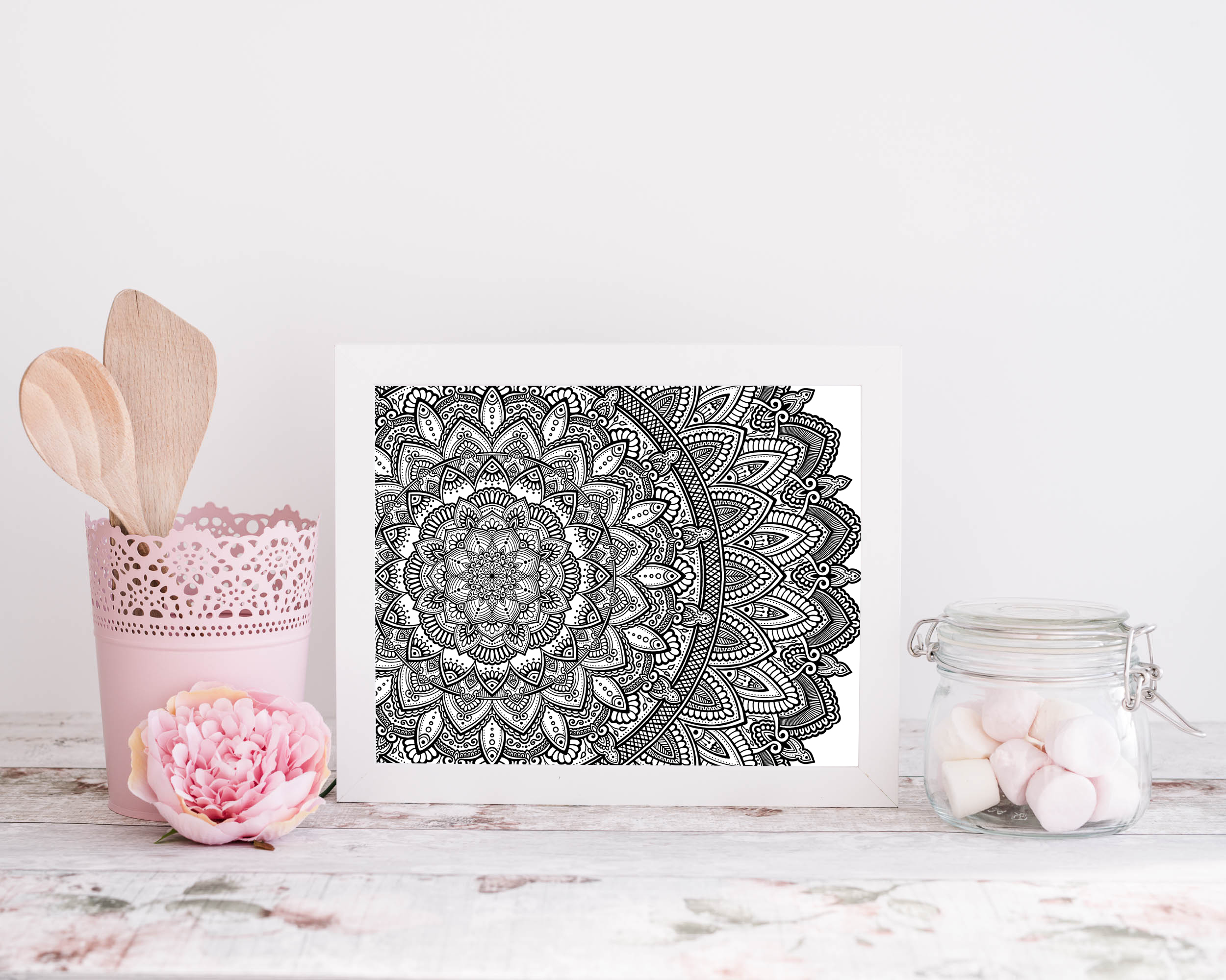
A generous mat border gives fine-detail work like this the breathing room it needs to be seen properly.
When to Use a Mat
Mats are most valuable for detailed, smaller prints where the work needs space around it to be appreciated. A highly detailed mandala at A4 size, given a 5cm mat on all sides, effectively becomes an A3 piece — and the extra space tells the eye to slow down and look carefully. Without a mat, the same print crammed to the edges of the frame feels rushed.
For large prints (A1 and above), mats are optional. The print itself has enough physical scale to command attention without additional framing support.
Mat Colour and Width
White or off-white mats work for almost everything and should be your default. They are neutral, they allow the print's colours to read accurately, and they age well. Avoid coloured mats unless you are very confident — they rarely improve the presentation and often introduce a tone that fights with the print.
For mat width: a minimum of 5cm on all sides for A4 prints, 6–7cm for A3. A common mistake is making the mat too narrow — the breathing room it provides is most of the value, and skimping defeats the purpose. One additional note: many framers use a slightly wider mat at the bottom than the top (by 5–10mm). This counteracts an optical illusion where equal borders appear bottom-heavy, and it is the detail that separates a professional frame job from an amateur one.
Step 3: Glass, Acrylic, or Open
Glazing — the transparent layer between the mat and the outside world — does two things: it protects the print from dust, humidity, and accidental contact, and it filters UV light that fades pigments over time. The question is which type to use, and whether to use it at all.
Standard Glass
Clear glass is inexpensive and gives accurate colour rendering, but it reflects significantly — in rooms with windows or strong ambient light, the reflection can make a framed piece almost unviewable from certain angles. It also provides no UV protection. We do not recommend it for archival prints.
Anti-Reflective or Museum Glass
Anti-reflective glass (sometimes called museum glass at the premium end) reduces surface reflection to near zero while maintaining colour accuracy. It is the best option for displaying prints in rooms with natural light and is what most galleries use. It is more expensive — typically 3–5 times the cost of standard glass — but for a print you care about and intend to keep long-term, it is worth it.
Acrylic (Plexiglass)
Acrylic is lighter than glass, which makes it preferable for very large frames that might be too heavy with glass glazing. It also has better impact resistance. The downside is that it scratches easily during cleaning and generates static that attracts dust. UV-filtering acrylic is available and performs well. For standard-sized prints, glass is generally preferred; for anything A1 and above, acrylic becomes worth considering for the weight reduction alone.
Unglazed (Open Frame)
Some people choose to frame prints without glazing — particularly for canvas prints or very textured media where glazing would flatten the surface quality. For our fine art paper prints, we do not recommend this: even in a clean home, dust accumulates on paper surfaces and becomes very difficult to remove without risking damage to the print. Glazing is protection, not just aesthetics.
Step 4: Where to Hang It
Placement is where most framing decisions either succeed or fail. A perfect frame on the wrong wall, at the wrong height, does the print no favours.
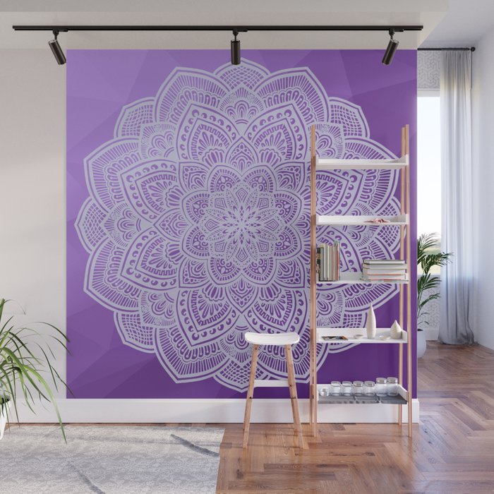
When scale and placement are right, art does not decorate a room — it defines it.
Height
The widely used rule is to hang the centre of the artwork at eye level — approximately 145–150cm from the floor. This is the standard used by most galleries and works well for most domestic settings. The logic is simple: you look at art with your eyes, so the artwork's visual centre should align with where your eyes naturally rest when standing.
There are sensible exceptions. Art hung above a sofa or desk should align with the furniture, not the standing eye-line — in this case, the bottom of the frame should sit 15–20cm above the back of the sofa or desk surface. Art in a hallway where people move past it can be hung slightly higher than the standing eye-line, because it will be viewed in motion rather than at rest.
Wall Choice
Natural light is the best light for art, but direct sunlight is its enemy. Position prints where they receive reflected or indirect natural light — the warm glow that comes from a window on the adjacent wall, rather than direct rays landing on the print surface. UV damage is cumulative and irreversible: a print in direct sun for five years will fade noticeably regardless of the quality of the glazing.
Avoid hanging art on exterior walls in climates with significant temperature variation — the wall surface can experience condensation as temperatures shift, and prolonged exposure to fluctuating humidity damages both the paper and the frame over time. An interior wall is always preferable.
Grouping Multiple Pieces
If you are hanging more than one piece together, the space between frames should be consistent — 5–8cm between frames is the standard for a cohesive grouping. Less than 5cm and the grouping reads as cluttered; more than 10cm and the relationship between pieces starts to dissolve. Use the same frame style throughout a grouping unless you have a clear, intentional reason to mix — consistency creates the visual coherence that makes a grouping feel curated rather than accumulated.
Step 5: Hardware and Installation
The final step is the most technical, and also the one most likely to go wrong if you underestimate it. A heavy frame hung on inadequate hardware is a real risk — to the print, to the wall, and to anything beneath it.
Know Your Wall
Different wall types require different fixings. Plasterboard (drywall) walls require wall anchors or toggle bolts for anything heavier than about 2kg — a standard picture hook pushed into plasterboard alone will pull out under load. Solid plaster or brick walls can take a standard nail or picture hook for light frames, and a wall plug and screw for anything substantial. If you are unsure what your walls are made of, knock on the surface: a hollow sound indicates plasterboard; a denser, duller sound indicates plaster over brick or concrete.
Hardware Rated for the Weight
Every piece of hanging hardware has a rated load capacity — use it as a guide and apply a safety margin. If your frame weighs 3kg, use hardware rated for at least 5–6kg. A framed A2 print with glass typically weighs 2–4kg depending on frame depth and material; A1 with glass can reach 6–8kg. When in doubt, use two hooks spaced along the top of the frame rather than one central hook — it distributes the load and prevents the frame from tilting over time.
Getting It Level
A small spirit level or a levelling app on your phone is essential. The human eye is remarkably good at detecting when something is even slightly off-level — a tilt of just 2–3 degrees is visually noticeable and persistently irritating. Mark both hanging points with a pencil before nailing, double-check the measurement between them, then check the level again after hanging before you put the pencil marks away.
The Common Mistakes, Briefly
Hanging too high. The most common mistake by a significant margin. When in doubt, go lower than feels natural — the instinct is almost always to hang too high.
Frame too small for the wall. A small print on a large wall looks lost. If the wall is large, either choose a larger print, use a mat that increases the overall size, or group multiple pieces together.
Skipping the level. Takes two minutes. Saves years of slightly tilted dissatisfaction.
Non-acid-free materials. The damage is invisible for years, then impossible to reverse. Spend the small amount extra on conservation-grade components.
Direct sunlight. Even the best pigment inks fade under sustained UV exposure. Position carefully and use UV-filtering glazing.
A Final Note
Framing a print well is a quiet act of respect for the work — and for yourself, since you will live with it every day. The decisions involved are genuinely worth making carefully. A print in the right frame, at the right height, on the right wall, with a few centimetres of breathing room on every side, does not just look good. It changes the energy of the room in a way that a print handled carelessly cannot, however beautiful the image itself.
If you have questions about framing a specific print from our collection, we are always happy to advise — just reach out via the contact page. We have framed a lot of our own work and learned most of these lessons the slow way.