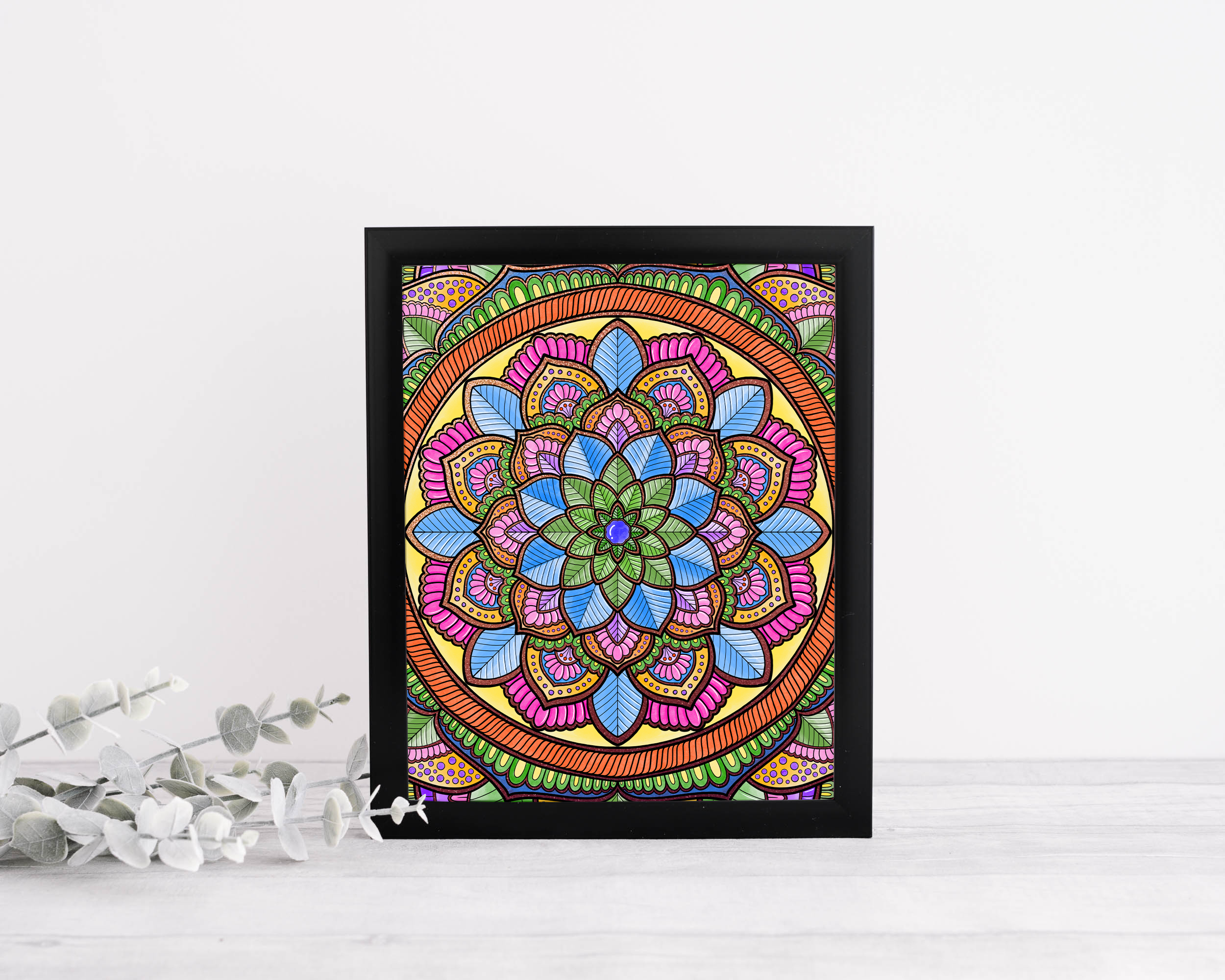
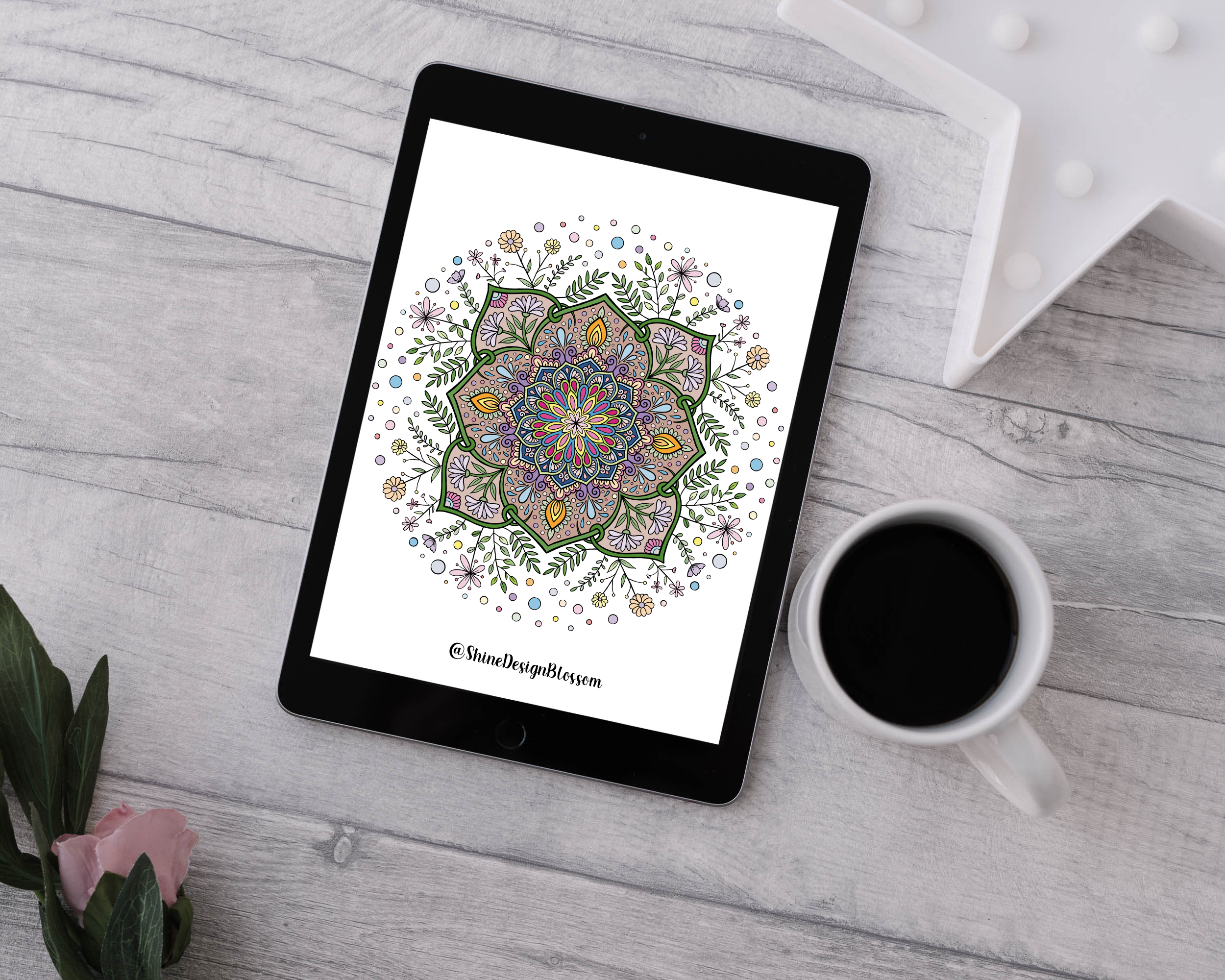
There is a specific quality in a line drawn with a well-loaded fineliner on cold-press paper that no amount of digital processing fully captures: a slight swell where the pen first touched down, a faint feathering where it lifted, and a variation in edge sharpness that changes with speed and pressure. That line has character. It carries the history of its making in its shape.
Most digital brushes erase all of that. They produce lines of uniform weight, perfectly antialiased edges, and a consistency that, paradoxically, reads as inconsistency with reality — because nothing in the physical world is that uniform. The result is work that looks competent but not alive. At Shine Design Blossom, we have spent years building a brush library that fights against this tendency — that insists on keeping organic imperfection at the centre of digital mark-making.
This article is a practical guide to how we think about and build custom brushes — specifically ones designed to capture the qualities of real ink, watercolour, and marker on paper. You do not need to use the same software we do. The principles apply across most professional illustration tools.
What Makes Ink Behave the Way It Does
Before you can mimic ink digitally, you have to understand what you are actually mimicking. Ink on paper is governed by four interacting forces that most digital brushes address clumsily, if at all.
Pressure changes line weight in real time — not just along a gradient from thin to thick, but in micro-variations tied to the rhythm of the hand. A stroke drawn slowly and deliberately has a different pressure profile than one drawn quickly. The digital equivalent requires pressure curves that respond non-linearly: very light at the extremes, building quickly through the mid-range, then softening again as pressure peaks.
Speed affects both weight and edge quality in physical media. A fast stroke is thinner and crisper; a slow one is broader and softer, often with visible texture from the paper grain catching the nib. Speed-sensitive brushes are underused in most workflows — many artists disable this parameter entirely and lose one of the most expressive variables available to them.
Ink load determines how a stroke begins and ends. A freshly loaded pen starts rich and dark, lightening imperceptibly as ink is consumed. Building ink-load variation into a brush — so that longer strokes fade ever so slightly toward their ends — adds a sense of continuous physical process that static opacity cannot replicate.
Paper texture is the most underrated element. The way ink sits differently on the peaks versus the valleys of a textured surface creates an edge quality that is neither crisp nor blurred but something in between — a soft grain that reads, subconsciously, as hand-made. Texture brushes that sample actual scanned paper surfaces are the single most impactful addition to any digital ink brush.
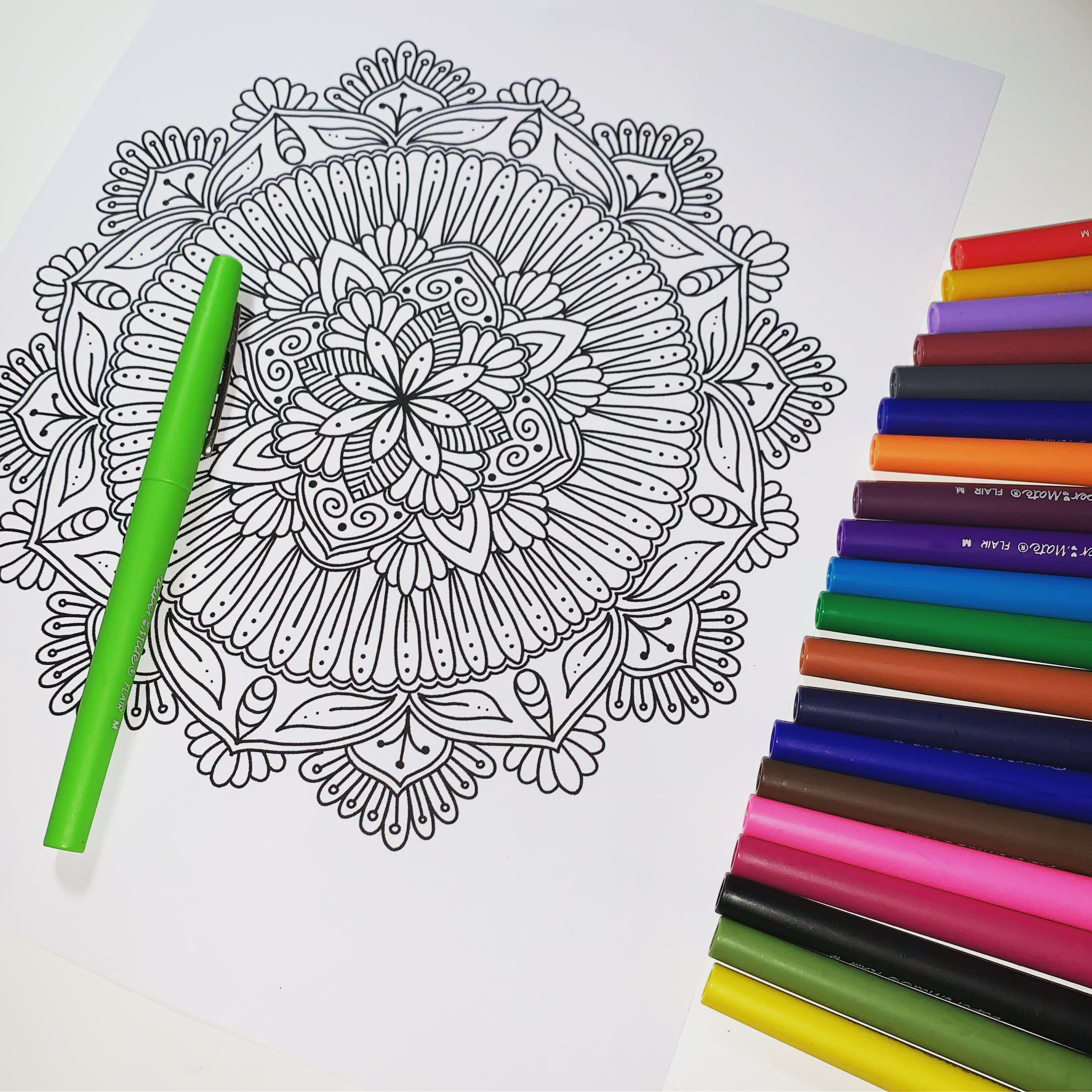
Study the physical tools before you build their digital counterparts. The markers do the teaching.
The goal is not to fool anyone into thinking the work was made by hand. The goal is to give the digital line the same vitality that a physical line has — to make it feel drawn, not placed.
Building a Fineliner Brush from Scratch
The fineliner is our workhorse for mandala linework — consistent enough for precise geometric patterns, but organic enough to carry warmth. Here is how we approach building one.
Tip Shape and Hardness
Start with a circular tip but reduce the hardness to around 85–90% rather than 100%. A perfectly hard circular tip produces pixel-perfect edges that look mechanical. The slight softening introduces a micro-fringe that reads as ink absorption into paper fibre. For very fine work, reduce tip diameter and compensate with increased opacity rather than going to full hardness.
Pressure Dynamics
Map pressure to size with a response curve that is concave — slow to respond at light pressures, then accelerating through the mid-range. This means very light strokes stay thin and delicate, while moderate-to-firm strokes thicken meaningfully. Add a small amount of pressure-to-opacity mapping (around 15–20%) so light strokes are also slightly transparent — mimicking a pen running low on ink at the beginning of a stroke before the flow establishes itself.
Texture Overlay
Scan a sheet of the paper you actually work on at 600dpi, desaturate it, and invert it so the paper grain becomes a light-on-dark texture. Apply this as a grain or texture overlay within your brush at around 8–12% strength. This is subtle but transformative — it is the difference between a line that looks digital and one that looks like it came from somewhere real.
Edge Jitter
Add a very small amount of edge scatter or jitter — enough to break the mathematical perfection of the silhouette without being visible as fuzziness. Think of it as simulating the microscopic irregularity of a metal nib's contact with a textured surface. Values of 1–3px on a 2000px canvas are usually right.
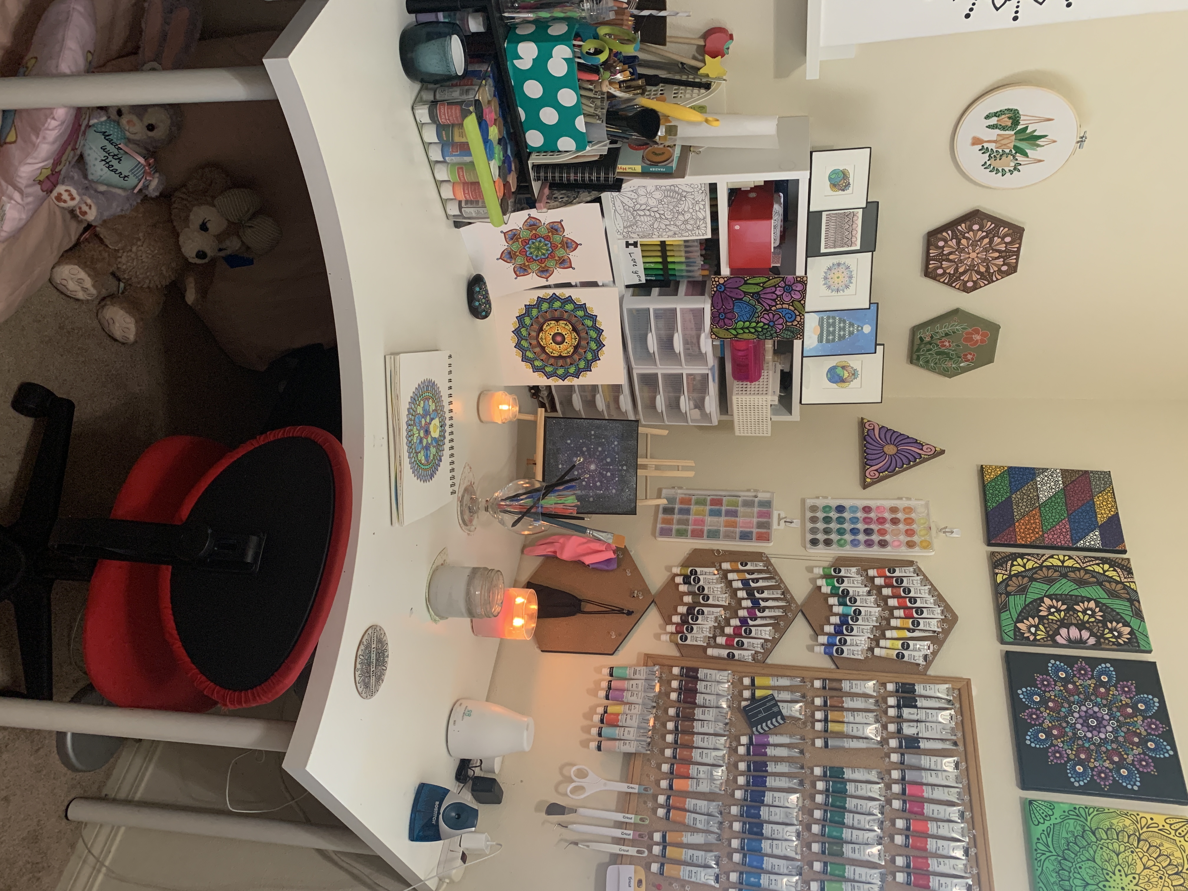
The physical studio is the reference library. Every brush we build starts with something we can hold in our hands.
Building a Watercolour Wash Brush
Watercolour is harder to simulate convincingly than ink because it involves so many simultaneous variables: pigment concentration, water content, surface tension, drying time, and the capillary action that pulls wet colour toward dry edges. We do not attempt to simulate all of this — we try to capture the visual impression of it.
The Wet Edge
The most distinctive characteristic of watercolour is the darker edge that forms as pigment migrates outward during drying. This can be approximated with dual-tip brushes where the outer edge of the stroke is darker than the interior, or by layering a semi-transparent stroke with a slightly concentrated edge pass. Some software has a dedicated wet edge parameter — use it, but keep values low (15–25%) or it quickly looks artificial.
Opacity and Flow Separation
Separate your opacity and flow controls and reduce flow significantly — down to 20–35%. Low flow means that single strokes build up colour slowly, requiring multiple passes to reach full saturation, which closely mimics the layered wash technique of traditional watercolour. Opacity controls the ceiling of colour density; flow controls how quickly you reach it.
Granulation Texture
Real watercolour granulates — heavier pigment particles settle into the valleys of textured paper while lighter ones stay suspended, creating a mottled effect. Simulate this with a texture overlay sampled from a photograph of actual watercolour washes on cold-press paper, applied at 10–20% strength. The goal is a subtle bumpiness in flat colour areas that breaks up the digital uniformity.
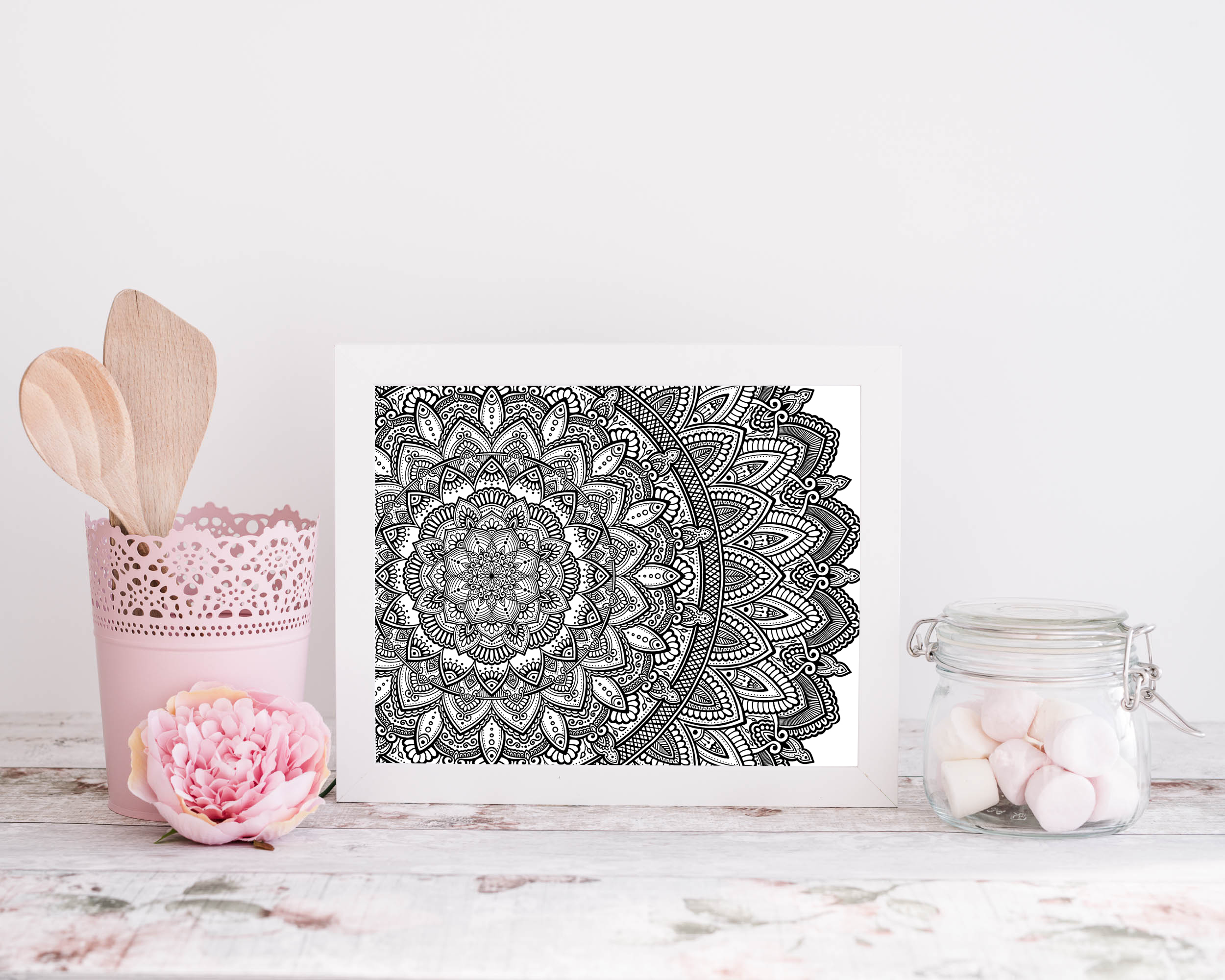
The precision and warmth of hand-drawn linework is the target. A good custom brush gets you most of the way there.
The Marker Brush: Capturing Alcohol Ink
Alcohol-based markers have a specific quality we love for colouring mandala work: a smooth, rich lay-down with visible blending at edges where strokes overlap. Unlike watercolour, they are opaque and fast-drying — but where wet strokes meet, the alcohol solvents reactivate each other briefly, creating soft blend zones.
To replicate this digitally, we use a flat, slightly textured brush with medium hardness (around 75%) and map pressure to opacity rather than size. The flat profile mimics the chisel tip of most alcohol markers. Overlapping strokes should build opacity incrementally — keep individual stroke opacity below 60% so that multiple passes create depth rather than a solid flat fill. The slight variation you get from stroke-on-stroke buildup is what gives digital marker work its life.
A Note on Restraint
The temptation, once you have built a library of expressive brushes, is to use all of them. Resist this. The same discipline that makes physical media work — limiting your tools to force creative solutions — applies here. For mandala work, we typically operate with three brushes per piece: a fine structural liner for geometry, a medium liner for fills and detail, and a wash brush for colour areas. Everything else is noise.
The brushes in our Blossom Brush Engine were built according to exactly these principles — years of refinement toward tools that get out of the way of the work and let the artist's hand come through. If you would rather start with something already calibrated than build from scratch, that is what they are there for.
Practice is the Real Brush
We want to close with an honest admission: no brush setting, however carefully tuned, replaces the physical intuition that comes from thousands of hours with real pens on real paper. The best digital brushes are built by people who also draw by hand — who know from muscle memory what a stroke should feel like, and who use that knowledge to calibrate what the screen produces.
If you are newer to drawing, spend time with physical media before investing heavily in digital brush customisation. The reference you build in your hands is irreplaceable, and when you eventually transfer that to digital, you will know exactly what you are trying to recreate — and why it matters.